Article on Facebook Envy: The name “Facebook” finally makes sense to me, because it's really all about the “surface”, the superficial stuffs.
Most of us in our shared networks came from a generation of never to display our closet' skeletons nor our laundry in the open; and share only the happy events in life. Only those who are really closed to us have seen our worst... very few of our failures would be recorded on our timelines. No wonder we see only hot chick and rods, extravagant vaca and sappy family photos on FB. I never posted about my dad having a stroke last summer (more a blog material). I'm aware not to be a party pooper on FB, cause it's a happy place for us to flaunt and bond. Ranting about others, politicians, celebs is however acceptable and very appropriate cause we bond even easier when we share our hate against common nemesis. Those born in the 90's and after have a very different way of using FB. I love glancing their posts! They openly broadcast their success and failures, loves and hates... yet the consequence of doing that has relatively less impact since most of them are still dependents with very little to no life obligations. Personally I don't take FB too seriously. I like to entertain and be entertained by images or words. It's a GREAT way to connect with new and old friends currently living in different time zones. However I rely mostly on personal visits to connect/reconnect whenever possible. Fb after all is really just a surfacebook, but I did make a few great friends such as Jeffrey Jones and Kerrin Howard whom I met first on FB.
0 Comments
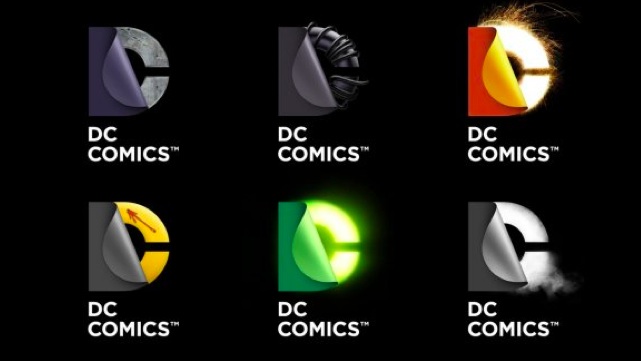 Notice the new DC logo at theatre when watching Dark Knight Rises? It's one of many variations in a brand identity system that invoked lots of online passionate debates about whether it is better and working. Remember Gap?. The difference is, Gap had almost zero likes. DC's new logo got lots of good reviews among designers, comic fans, and “normal” folks.
For a love brand such as DC Comics, you know for sure any change will draw tons of resistances whether they are justified or not. People are just so attached to their own projections of what the brand is, guaranteed there would be no sure win (“sure lost” , again, like “Gap” is much easier to “achieve”:P). I personally like this design (creator being a client has nothing to do with it) a lot. Like most geeks, I grew up reading comic books. When I saw a few of the variations upon this system's release, I got all the super hero narratives right away. The visuals invokes deep story telling, unlike the previous flat, line art rendition. The new system is dimensional, dynamic, and works very well onscreen (from Iphone to Imax... (not part of Apple's ecosystem ;)). Some said the logo is corporate, I disagree. Not the versions with the illustrative treatment. The flat version can be, which is appropriate, it's owner by Warner Bros after all. Downers out there, do give it some time... it'll grow on you. I recall how negative some of our cohorts felt when they first learned about the change of our B-School's name from Chicago GSB to Chicago Booth. Some even created an online group to boycott against the evolution. Few years after none of us refer ourselves as GSB alumni anymore. http://www.ajiritea.com/HandmadeLabels.html
Leveraging the indigenous resources (raw materials, human capital...) at the bottom of the pyramid, yet by the time it gets distributed to the specialty stores in Manhattan and SF...etc, it's priced like a premium brand. $9/350g for loose leaf tea, that's almost as much as you'd pay at Mariages Freres! let's hope that the foundation do benefit from such a high margin (the only high cost expected in the operation will be marketing). Distribution is still limited since they aren't even in Wholefoods. Winning a package design award may get them the needed exposure. Keep up the good work and congrats on winning the design award! Recently several clients requested me to create brand assets with a specific yet similar visual style. I started asking myself when was the last time that happened? Was that coincidence or a reflection of a bigger trend? In fact I can recall several significant visual fads in the past couple decades. They were indeed the results of certain technological or market disruptions (or bubbles). I do have a few subjective observations, they are of course by no mean the outcome of any empirical research.
Bubbly 90's: During the dot com bubble when the optimism was high, businesses competed to demonstrate their creative capacity as assets. All fundamental financial ratios were irrelevant as long as your business has something to do with web. The bubble has furnished us with numerous projects requesting us to create assets that are gestural, creative, whitty and whimsical. Everyone was in a good mood. We all know what happened when the bubble was burst. Photoshopper: When Adobe Photoshop became such a hot app that threatened the livelihood of many professional photographs, designers and illustrators were also pressured to create assets that shamelessly revealed off the different special and layer effects of the software. In my opinion, the design field has entered a dark age that resembled the naissance of desktop publishing. When visual communication served a better purpose promoting the tools than communicating a message, regardless how brilliant the tools are. Recession realist: Recession hit US right after W took over the white house. Layoffs, budget cuts, for sure less experimentations on marketing communication. The consumers were spending mostly on the essentials. Big companies were playing it safe, even with brand building. We were assigned many projects using more realistic visual styles, depicting products instead of concepts. Technical line art: I had no idea where this came from, The line drawing used mainly in instructional inserts or back panels (which we also do a lot) became mainstream. They took on a more heroic role in communication in packaging, collaterals, and info-graphical materials. Interestingly, this style seems straight forward at first glance, but indeed requires a quite strategic mind. Designers who create artworks has to make smart decision on what to show and what not. Importance of elements represented only by differentiating line weight or some minimal uses of colors. Revival of fun (or bubble?): They called it the second coming of tech bubble in the silicon valley.Companies such as Groupon, Facebook...etc, with unjustifiable earning ratios and valuation do well in their IPOs. With VCs hedging their bets investing in multiple startups ran by young leaders who were born shortly before the first bubble, we see a lot of parallels between the two markets. We are getting requests for doing fun concepts again. More metaphorical story telling, more gestural and fun visual styles, simplistic, humorous, gestural...and less direct depiction of products and services. The increasing demand for creative execution reminds me the best time in 90's, yet it also reminds me the lost of paper wealth that many of my peers suffered. Stock options that once worth millions became liability if realized. Some of us didn't get hit as badly due to a high percentage of assets invested in Real Estate, which did quite well for the following decade. Equity grew at double digits for years... until of course the recent crash of market in 2007. Worst of it all, is that we've not yet seen the bottom of the real estate bubble yet. After recent Facebook's IPO, many newly minted millionaires have entered the housing market looking for homes. Maybe this second coming of tech bubble will help lift the market, and bail out some of those Real Estate investors who are still drowning under water now. Wishful thinking, I know. While you are at this site, download the fun and interesting guides on creative team, salary and much more ...
http://www.creativegroup.com/newjobtitles |